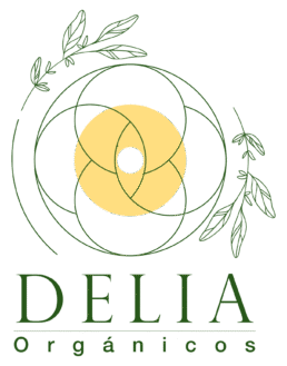
Delia - Mexico
Branding development for organic food company.
Client
Delia
Year
2025
Services
Branding
Content Strategy
Design Labels
Country
Mexico
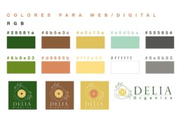
Why this colors?
The color palette chosen for the branding of the organic food products company was carefully designed to convey a sense of nature, freshness, health, and connection to the earth. Shades like olive green and bright green directly evoke nature, plants, and the freshness of ingredients, reinforcing the perception of healthy and eco-friendly products. The light mustard yellow adds a warm, sunny touch, associated with vitality, energy, and closeness, while also reflecting natural ingredients such as grains, honey, or turmeric.
Terracotta and soft brown tones represent the earth, rusticity, and craftsmanship, strengthening the idea of an authentic product made with care and respect for the environment. Finally, the use of a neutral gray helps balance the composition by bringing sobriety and a clean aesthetic that supports the clarity of the visual message without competing with the dominant natural colors.
This combination of colors creates a harmonious visual identity that aligns with the brand’s values of sustainability, wellness, and transparency.
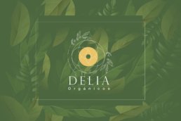
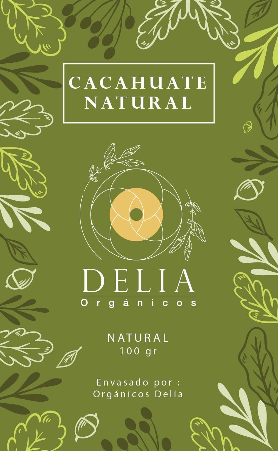
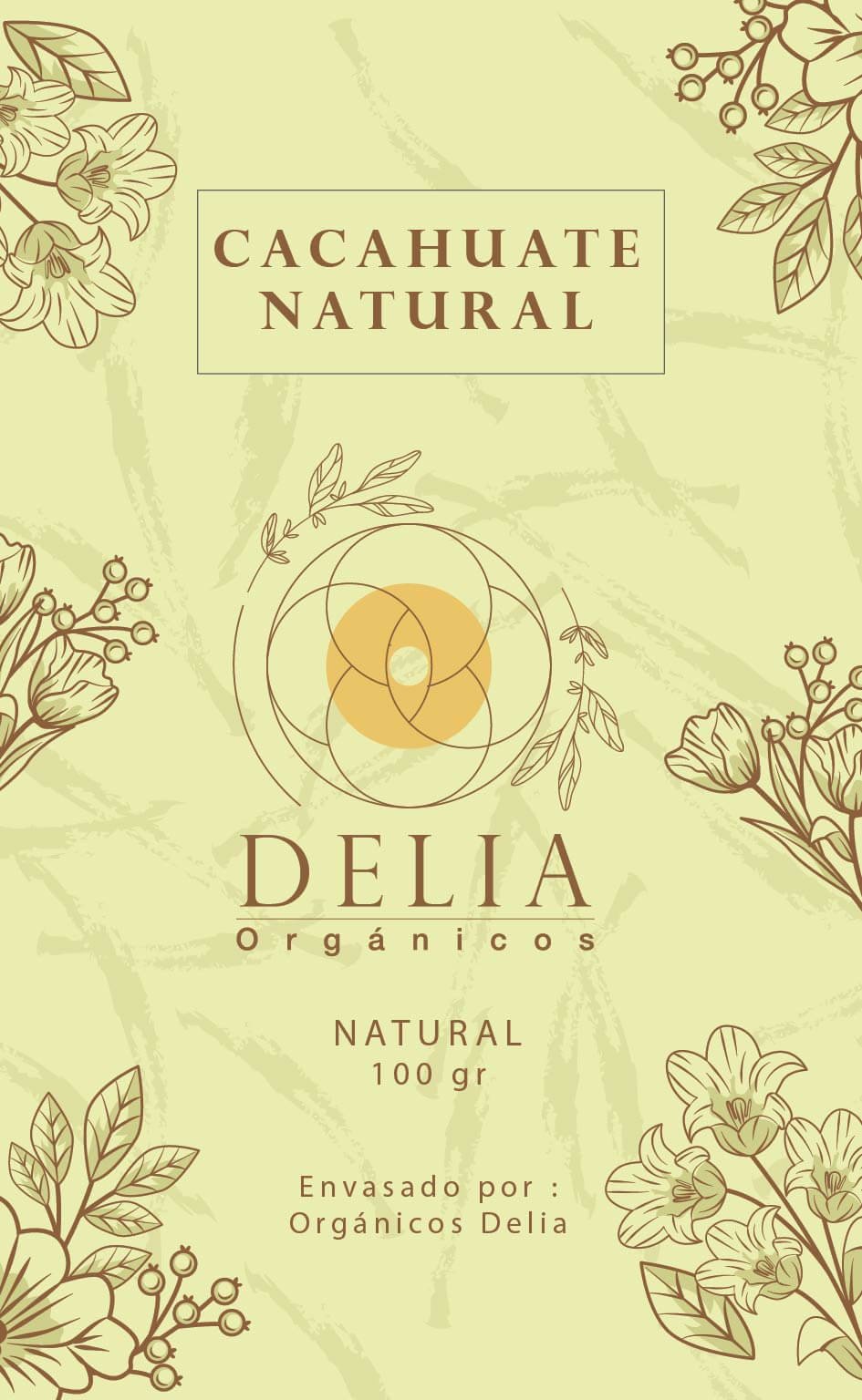
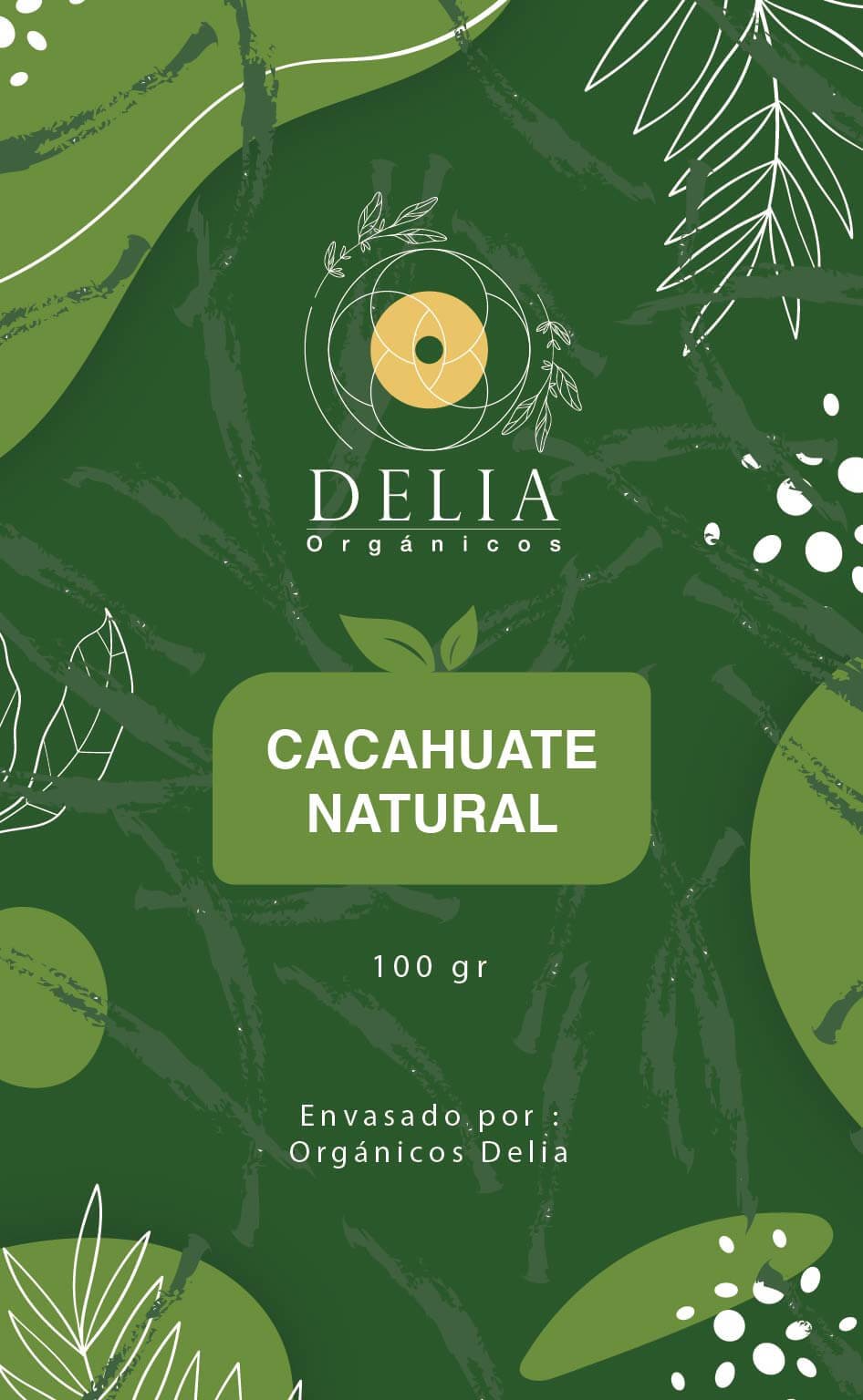
Labels design
Pantone® 7743 C
C55 M0 Y71 K65
#28581a
Pantone® 7586 C
C0 M32 Y57 K45
#8b5e3c
Pantone® 7405 C
C0 M14 Y60 K12
#e0c15a
Headlines:
Google Font Jost Bold
A B C D E F G H I J K L M N O P Q R S T U V W X Y Z 1 2 3 4 5 6 7 8 9 0 A B C D E F G H I J K L M N O P Q R S T U V W X Y Z 1 2 3 4 5 6 7 8 9 0 A B C D E F G H I J K L M N O P Q R S T U V W X Y Z 1 2 3 4 5 6 7 8 9 0
Paragraphs:
Google Font Jost Light